Color Psychology is of great importance in Web Design is what I will discuss today in this post.
Designers use colors in web design. They consider aspects of brand value and target audience. After this, they are deciding on the color scheme for the website.
The selection of color has a strong impact on the minds of your consumer.
Color choice is important to design a website that converts. After all, conversion is the one goal all marketers aim at.
Colors arouse emotions, desire, and inclination. When your audience comes across your website, there are lots of things happening in the back of his mind.
Color hits the psychology. When we see a color, it affects the hypothalamus region of our brain. It then sends signals to pituitary glands and then to thyroid glands. This results in the release of Hormones, which triggers emotions. These emotions lead to particular behavior.
Read Rachel Griffith’s article about how colors affect consumers product perceptions. He says that customers take less than 90 seconds of viewing to make a subconscious judgment about a product. Moreover, color alone is the basis of a majority of these people’s assessment.
In fact, almost 85% of consumers state that color of the product induces them to make a sale. Moreover, 80% of consumers believe that color enhances brand recognition.
It is a no-brainer fact that color is a significant factor that affects conversions. In my previous post, 6 Conversion Rate Optimization Tips for Your Website, I had briefly discussed the role color psychology play in affecting conversion rates of a website.
Colors impact all our visual experiences. It plays a pivotal role in various aspects of marketing. You must read Jill Morton’s research-backed analysis on Why Color Matters. This post will enlighten you on data that’s crucial for any consumer-oriented organization.
Since color affects customer’s behavior, use the ones that work best for your website. Use proper colors in your logo, background, headers, borders, pop-ups, call-to-action buttons, and fonts.
It is necessary that we understand the basics of Colors – its symbolism, usage, and trend. So here we go:
Let’s understand the Color Terms
There are different color terms that every web designer should know. They are:
Hue: It is similar to colors and refers to all the 12 colors on the color wheel.
Shade: Add black to a hue/color and you create a Shade.
Tone: A hue made dull by adding gray (black + white). If your client says that you need to tone down the color, it means you have to reduce the intensity of the color.

Tint: A color made light by adding white. These are pastel colors.
Saturation: It refers to the intensity of a color OR you can say the purity of a color. More the gray, more the desaturation of the color.
Value: means lightness or darkness of a color.
Understanding Color Wheel to enhance your Website Design:
A Color Wheel, also known as Color circle is an abstract illustration of color hues, tints, shades and tones around a circle that shows relationships between the primary colors, secondary colors and tertiary colors.
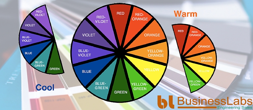
Now, there are two basic types of color groups: warm colors and cool colors.
Warm colors are the ones in the red area of the spectrum (i.e. Red, orange and yellow).
Cool colors are the colors in the blue area (i.e. Blue, purple and green).

Choosing Color Combinations for Your Web Design:
The right use of colors is crucial to a website’s success. Should a designer go for a single color site or use 2-3 colors? The color wheel is an inspiring tool for web designers to select the best color combinations.
Let’s have a look at the types of Color Combinations:
Monochromatic Color Scheme: These are the single color used along with its tints, shades, and tones. The monochromatic color scheme gives a neat look to the website in varying shades. Let us see this image where Hue, Tints, Shades and Tones of Yellow is illustrated.
Analogous Color Scheme: These are hues that appear side by side on the color wheel. Most web designers use this color scheme and for web designing.
Complimentary Color Scheme: These are colors that are opposite to each other on the color wheel. For example using a warm color like orange with a cool color like blue. Using this color scheme is pleasing to the eye and help designs stand out.
Triadic Color Scheme: A combination of colors that have equal spacing. It forms a triangle on the color wheel, as shown in the image below:

How colors impact your web design: Understanding Colors and Emotions:
The color is as important as other essential features like site layout and structure or the navigation. Color psychology communicates a positive or negative message. It encourages sales, calms the mood, and initiates a prompt response.
By using color psychology, designers may decide to choose colors for their website, logos and brand materials:
Red: Red denotes different meanings in different contexts. It is the color of fire and symbolizes warmth, intensity as well as danger. It is also a color to express energy, strength, confidence, and power.
Blue: This color communicates trust and calmness, spiritualism and professionalism. Hence, banking brands, health practitioners, and hospitality brands prefer this color. It is also a color favored by men.
Green: Green symbolizes nature, growth, sustainability, and health.
Yellow: Yellow is for the youth. Since bright yellow is a color that catches attention, it is best for certain calls to action.
For example, important road signs are in bright yellow in color.
You will hardly come across a website that is yellow in color, except for websites related to kids.
Purple: Purple signifies nobility, wealth, wisdom, intimacy, relationships and luxury.
Black: Like Red, Black too has different meanings in different contexts. It communicates luxury and affluence as well as death, evil and mourning. When it comes to apparel, it signifies formality.
White: It represents purity, simplicity, peace, and perfection. At the same time, it also means producing little or no vegetation- hence cold and sterile.
Quick tips on using accurate colors in web design
- Use Red in your web page when you want to communicate something urgent. Some examples are offering last minute discount, early bird offer, and limited-period offer.
- For your call-to-action buttons prefer Red or Orange. These colors denote a sense of urgency and dominance.
- Professional services like banks, hospitality, clinics and doctors should use blue as their corporate color.
- If you are targeting female audience, use soft and soothing shades. Use different shades of Pink or Purple in your website. These colors symbolize love, affection, and romance.
- If you are targeting men, do not use colors like Purple, Orange, and Brown. Instead, use Blue, Green or Black.
- For products or services meant for kids use bright colors. Colors like red, orange or yellow rather than black, white or brown.
- Black is a universal color; it defines luxury and is for the affluent group of people! Think of all the expensive things and there will be a dash of the color black. One recent example is Black sedan. Sedan also comes in white, but the black ones are more expensive than their white counterparts. If you deal with products/services meant for the affluent, use black for your website.
How Color Psychology empowers a brand and brings more customers onboard
- 92% of customers believe that color presents an image of impressive quality.
- 90% of businesses feel that color can assist in attracting new customers.
- 90% of customers say that they remember presentations and documents better because of colors.
- 83% consumers believe that color enhances the visual appeal of the presentation. Colors make the presentations appear more successful.
- 76% people believe that the use of color makes their business look larger to clients.
Source: http://www.colorcom.com/research/why-color-matters
The Best of BusinessLabs Case Studies: Understand Usage of Color Psychology for your Website
At BusinessLabs, our focus has always been to help businesses prosper. We help clients realize their business objectives. Moreover, color psychology claims a significant position in our design strategies.
Designers at Business Labs understand the essence of a brand and the type of audience it wants to reach. It is then that they deploy the right color to generate the desired response.
Below are few of the Case studies to give you understanding about which color is used in the particular website design and what was the strategy behind selecting the color:
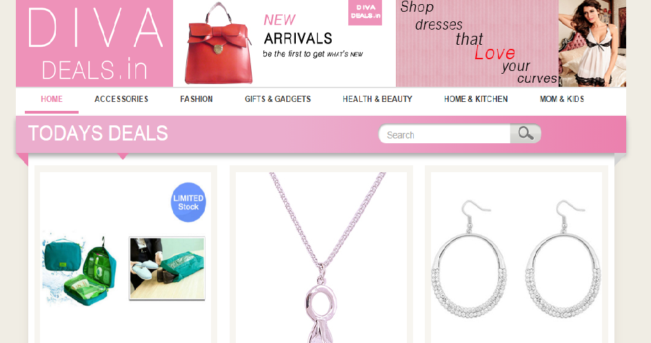
Divadeals:
Divadeals.com deals with women related products like accessories, fashion, home decorations, and more. Color psychology of pink says that is the best color that goes with female audiences. Pink stands for romance, affection, and sensitivity. Women tend to like this color above all other colors. Hence, designers selected pink as the main color against a white background.
Gucci:
Gucci products are natural. They are leather-made. Hence, Gucci has natural dark brown colors on the website. Designers have used different shades of brown along with against gray combination.
Business Labs:
Our business is client centric. Customer’s business objectives are our prime focus. We have done amazing work for our clients and would like to do more.
For our website, we decided to go for a Complimentary Color Scheme, i.e. colors that are opposite to each other on the color wheel. We have used a warm color like orange with a cool color like blue. Using this color scheme is pleasing to the eye and help designs stand out.
The designers have used orange for major sections of the web. Orange evokes excitement and warmth. It is the color that quickly draws visitor attention. The website also shows a beautiful collaboration with the color blue. Blue stands for peace and calmness.
PiaKaGhar:
Piakaghar.com is about premium brands related to men’s and women’s wear.
In this website, the designers did not use many design elements. This site makes perfect use of the Positive and Negative Space so that products displayed stand out correctly.
Remember, perfect balance between positive and negative space on your website is a critical factor while designing a high-quality website. Read our interesting article on How to use Negative Space to make Awesome Web Design. This post will help you learn, how to use design concepts on your website while making the perfect use of space. After all, a professional website does not mean a site full of informative texts and graphics.
White stands for purity and innocence. Red evokes emotions of warmth, intensity & excitement. Black is all about sophistication. Red, White, and Black are just the right color combination. It defines today’s fashion that is pure yet intense, innocent yet sensual.
Feedilicious:
Designers at Business Labs gained full insight into the business type of Feedilicious. Feedlicious has 275 successful projects. It has 3200 real-time feedbacks and 75 happy clients. Feedilicious is about rich data.
They decided on black – the color that denotes luxury and affluence.
Web designers at Business Labs understand how businesses sell products online. They also know how color affects consumer decisions. Before they start designing a website, they study the product/service type, the industry/market, and the target audience. Then they come up with the right color theme that suits the product, its market, and the consumers’ mindset.
You should also read our post How to Design a Website to Increase Sales. The article discusses the factors that go into developing a website that brings in good profits. You will get to know exactly what all it takes to increase sales through your site.
Premium Draught:
Located in Houston, Texas, Premium Draught is a beer growler fill station. It deals in high-quality beer. Designers did not give a second thought and decided to go for Black. They have used Mustard yellow in places. This provides the perfect contrast that catches attention instantly.
Must Read Guides:
Boldking:
Boldking offers efficient, original and pocket-friendly shaving set. The designers knew what color men prefer most. They know how to sell a product to men. Hence, they chose the classic gray-white-blue color scheme for Boldking.
Web designers at BusinessLabs are a hand-picked lot of talent. They go the extra mile to understand client’s business. They understand their target audience. They are not just designers – they know business and competition equally well.
These business designers have helped scores of companies reach their goals. Now it can help you too.
Here’s the complete list of services we provide. Pick the ones that you require for enhancing your sales and Contact Us today!
How successful brands perceived color psychology and used them?
Blue evokes a feeling of faith, trust and security.
The lighter shades of blue are for calmness and serenity. Dark blue symbolizes professionalism and truthfulness. The world’s biggest social network confides in the color blue as their primary color.
Yes, we are talking about Facebook. It is an organization that values transparency and trust. Hence, it comes as no surprise that the website has a background.
Red evokes excitement and energy.
The Coca-Cola website is the best way to understand the success of red color in promoting a brand.
Red is the primary color used against white and light gray background. This enhances visibility. The phrase “Open happiness” phrase is in red color. This provokes people to get their drink right away!
As pointed earlier, men prefer blue most.
Branding guys at Gillette knew this and decided to go with the color on their website. The color completely supports the Gillette Advertising Slogan:
“The best a man can get.”
Pink signifies affection, romance, innocence, compassion, sensitivity and it gives warmth.
Pink is a color preferred by young girls, and people consider it as a feminine color. The Barbie website uses pink all over.
I do not remember having come across a site more pink than the Barbie website. Ask any girl, what color they visualize when they think of Barbie? I am sure they all will have one say – it is pink!
In this guide by Julie Neidlinger talks about a survey. It is on color psychology. The survey studies what colors to use in respective parameters. This post is useful for understanding the usage of colors.
Conclusion
The color psychology is an intriguing study. There’s nothing as the best color. No color guarantees hundred percent conversions on your website. Thorough research of the industry is necessary. Understand the target audience is critical.
Before you go on to select color schemes, make sure your basics about color are clear. Spend time assessing your goal of creating a website. Also, study what color combinations successful brands use. Study how have they been able to achieve results by applying them. Doing this will help you learn the tricks. Use the color of your choice for your website.
Let us know what colors have you used on your websites or for your clients project and what your favorite picks are.
We have also collated few conversion optimization tips from 10 conversion rate optimization experts
Do leave us a comment – It helps us connect to all intelligent designers out there and learn from them, after all, there’s no end to learning.
Share the post if you think it has helped you in learning something. Share it if you think it will be useful to your friends and acquaintances.

